


Money Talk
The New, Volatile Stock Markets
Thursday, April 3rd, 2008If you follow the financial press, or watch a financial news network like CNBC, you’ve heard a great deal lately about how volatile the stock market has been lately. Every day, it seems, the Dow Jones Industrial Average seems to either jump more than a hundred points, or dip more than a hundred points. People who, well, let’s just say, people of a certain generation have been waxing philosophic about how a hundred point move on the Dow was unheard of in their day, and now it happens all the time.
This got me thinking: are we just enamored of large numbers? The DJIA is, after all, an average, so the number of points it moves on any given day isn’t as important as the percentage change that move represents. And, when the Dow was 6,000 (late-1996), a 1% move only represented a 60 point shift. Today, with the Dow over 12,000, the same 1% move represents 120 points. Perhaps there were lots of 60 point shifts twelve years ago but no one remembers those as clearly as the triple digit shifts they see today?
Here’s a telling graph:

The above trend lines represent the average daily shift in each of the three major indexes for each month over the last ten years. In January, 2008, for example, the average daily move for the Dow (up or down) was 1.27%. In the same month, the S&P500 moved an average of 1.31% each day, and the NASDAQ moved an average of 1.40%. As you can see by the trend lines, these numbers are higher than they’ve been for around five years, so there is some justification for all the bellyaching of recent months.
That said, it’s not nearly as bad as it was back in 2000-2003, particularly on the NASDAQ, where average daily shifts regularly topped 2%, sometimes even 3% or 4%.
This graph might be clearer:

It’s the same data, but the daily averages are grouped by year, rather than by month. Here, we see that averaging together all of 2008 so far (January through March), this year is indeed more volatile for the Dow and S&P500 than any year in the last 10, except for 2002. For the NASDAQ, though, it still pales in comparison to 2000-2002, and is even slightly more stable than 1999. Comparing the two graphs, we see that 2000-2003 had some high (>2%) months and low months, so while the peaks were worse than what we’re seeing now, the year-long averages balanced out. This is telling as we remember that 2008 still has 9 months to go, so the overall annual average might settle down quite a bit before it’s done.
Bottom line: yes, the markets are volatile. But no, this isn’t some calamitous event that we’ve never seen before and, in fact, in some cases it has been much worse. Also, my point from above still hold some water, I believe. Larger ordinal numbers create a bigger psychological impact than the changes of years past. Our memories are short enough as it is, and a constant stream of triple-digit changes help to cloud those memories even further.
At any rate, I hope you’re all enjoying the (bumpy) ride…
Categories: Money Talk | Comments Off on The New, Volatile Stock Markets
Was that my stomach back there?
Saturday, January 26th, 2008 Last Friday, January 18, 2008, the Dow Jones Industrial Average closed at 12,099.30. This past Friday, January 25, 2008, the DJIA closed at 12,207.17, a gain of 107.87 points. No big deal, right?
Except during the week, it got as low as 11,644.08 and as high as 12,481.60. That’s a swing of 837.52 points, or almost 7%, in just four days (Monday was the Martin Luther King Day holiday). Wednesday’s swing alone was almost 600 points.
Lesson learned: today’s stock market is not for the feint of heart. Also, don’t panic. It will all work itself out in the end…
Categories: Money Talk | Comments Off on Was that my stomach back there?
Making Buildings out of Money
Tuesday, November 20th, 2007 Just so those Italians know you don’t need a leaning tower to do clever camera tricks. The $10, $20 and $50 bills are here.
Hat tip: Lisa Fiorenzo
Categories: Money Talk, Random Acts of Blogging | 1 Comment »
A-Rod on his way back to the Yankees
Monday, November 19th, 2007Alex Rodriguez says his contract talks with the Yankees are in the bottom of the fifth inning.
I have no idea what that means. But I do know what this means:
“Long after baseball, New York is going to be part of our lives,” he said. “I have some unfinished business in New York.
I can’t tell you how glad I am to hear him say this. When he opted out of the contract, and had his agent do it during Game 4 of the World Series, I had written A-Rod off as a businessman who just happened to play baseball. A hired gun.
This tells me that it bothers him on more than just a professional level that he had one of the greatest indivdiual baseball seasons ever and fell apart in the post-season. I know that the rest of the team fell apart as well, but I think A-Rod expected himself to carry the team on his shoulders, and he didn’t do that. And that bothers him.
The only thing better than having one of the best players in baseball as your third baseman is having him there with something to prove.
Categories: Money Talk, Sports Talk | Comments Off on A-Rod on his way back to the Yankees
PC Market Share – Q207
Sunday, July 22nd, 2007IDC just released league tables detailing the market share of the top 5 PC makers in the United States and globally. Here’s the US chart:
|
Rank |
Vendor |
2Q07 |
Market |
2Q06 |
Market |
2Q07/2Q06 |
|
1 |
Dell |
4,854 |
28.4% |
5,437 |
34.1% |
-10.7% |
|
2 |
HP |
4,023 |
23.6% |
3,193 |
20.0% |
26.0% |
|
3 |
Gateway |
965 |
5.6% |
1,039 |
6.5% |
-7.1% |
|
4 |
Apple |
960 |
5.6% |
761 |
4.8% |
26.2% |
|
5 |
Toshiba |
901 |
5.3% |
600 |
3.8% |
50.0% |
|
6 |
Acer |
888 |
5.2% |
337 |
2.1% |
163.8% |
|
Others |
4,492 |
26.3% |
4,569 |
28.7% |
-1.7% |
|
|
All Vendors |
17,083 |
100.0% |
15,936 |
100.0% |
7.2% |
And here’s the worldwide chart:
|
Rank |
Vendor |
2Q07 |
Market |
2Q06 |
Market |
2Q07/2Q06 |
|
1 |
HP |
11,335 |
19.3% |
8,303 |
15.9% |
36.5% |
|
2 |
Dell |
9,491 |
16.1% |
9,978 |
19.1% |
-4.9% |
|
3 |
Lenovo |
4,879 |
8.3% |
3,989 |
7.6% |
22.3% |
|
4 |
Acer |
4,261 |
7.2% |
2,742 |
5.2% |
55.4% |
|
5 |
Toshiba |
2,407 |
4.1% |
1,981 |
3.8% |
21.5% |
|
Others |
26,452 |
45.0% |
25,303 |
48.4% |
4.5% |
|
|
All Vendors |
58,824 |
100.0% |
52,297 |
100.0% |
12.5% |
Information Week headlines their article with “Apple Ties For Third In U.S. PC Market,” which is technically true, although the leader sold more than five times as many PC’s. It also points to Apple’s impressive 26.2% growth, calling it a “halo effect” from the iPhone and the iPod before it and mentioning those adorable “I’m a Mac, I’m a PC” ads, but fails to mention Toshiba’s 50% growth and Acer’s 163.8% growth (both companies are within 75,000 units of Apple). Those two companies also cracked the Top 5 globally.
The bottom line here is that it’s still a two-vendor race between Dell and HP, both in the U.S. and Worldwide. Apple’s had a great year, but if they want to make a true dent in the PC market, they need to move out of the educational and Starbucks markets, and get into the big time.
Categories: Money Talk, Tech Talk | Comments Off on PC Market Share – Q207
Before He Gets Started…
Thursday, June 28th, 2007Michael Moore’s newest documentary hype-machine, Sicko premieres this Friday. In the movie, Mr. Moore is going to tell us, through rather dramatic footage and hand-picked testimony from industry whistle-blowers that insurance companies are evil and exist only to screw over the American people. He was on The Daily Show tonight and told Jon Stewart that insurance companies are profit making businesses, and that the only way they can make a profit is by charging huge premiums and then not paying claims.
Well, before this turns into a “story with legs” and it becomes impossible to say anything about insurance that contradicts the movie, please allow me to share some of what I learned from five years of working in the insurance industry:
1) Insurance Companies Rarely Make Money Selling Insurance
Most of the time, insurance companies pay out slightly more in claims and operating expenses than they take in from premiums. Here are some facts:
The Insurance Information Institute:

Combined Ratio is the ratio of losses and associated expenses to premiums, reflecting the overall underwriting profitability of the company. If it’s below 100 (i.e., losses + expenses < premiums), then the company is making money from its insurance policies. If it’s more than 100 (losses + expenses > premiums), they’re losing money. You’ll note above that as of 2004, the industry average had remained above 100 since the 1970’s.
More sources:
The Motley Fool:
The industry’s average combined ratio in 2005 was 106.2%.
ISO:
In 1995, the industry average combined ratio of 106.3% was the “best combined ratio in seven years.”
Carinsurance.com (speaking about all Property/Casualty insurance, not just car insurance):
The 93.2% estimate for 2006, if accurate, would represent the industry’s best underwriting performance since the 93.3% combined ratio recorded 70 years earlier in 1936 [and only the second underwriting profit since 1978].
[UPDATE, as of 9/5/2015:
Categories: Money Talk, Movie Talk, Political Rantings | 6 Comments »
Yankee Stadium Blogging…
Sunday, June 10th, 2007Reporting live from Yankee Stadium…It’s Bat Day today in the Bronx.
The game started at 1:05. It is currently 1:30, and there are already 3 bats available for sale on eBay.
I have two (one for each kid), and on my way to my seat, someone offered me $200 for one of them. He obviously doesn’t understand the need to have two of anything when you have two children…
Categories: Money Talk, Sports Talk | 2 Comments »
Some Thoughts on Idol Gives Back
Friday, April 27th, 2007OK, I’ll admit it – my wife and I are American Idol fans. For what it’s worth, we’re not Fanjaya fans; we’re the kind that actually looks for some high quality music from the contestants. So there’s that…
Anyway, last night’s show, Idol Gives Back, was clearly something special. It’s great to see a pop culture behemoth finally do something with it’s marketing potential other than just selling soap. And of course, when the show was over, they got some help from my family as well.
The show was obviously designed to make us think, but the thing it made me think about most rather surprised me.
We’ve all seen many (too many? not enough?) pictures of the African poor – the young mothers dying of AIDS, the children living in mosquito-ravaged conditions, dying of malaria, malnutrition, or just basic neglect. We’ve also seen many pictures of the American poor – particularly since Hurricane Katrina created so many more of them on a single day.
This is the first time in my memory, though, that these two sets of images were set side by side in this way. Watching it, I couldn’t help but notice how much better off the American poor were than the African poor.
The African children were dressed in rags. The American children were wearing clean clothes. The African children had crooked or missing teeth. One of the American children was wearing braces on his teeth, and several were wearing eyeglasses. The African food distribution center was a large room, empty except for a large table in the middle, where dozens of kids were each given what appeared to be a clear broth with some kind of meat in it (hard to tell exactly what it was). The American food distribution center was a modern warehouse with food stacked on palettes, literally reaching up to the ceiling. The facility was staffed by dozens of volunteers, who distributed nutritionally balanced grocery bags to hundreds of families at extremely low costs (e.g., $1/bag). The African school was a group of children in a relatively empty room with a few adults, sharing materials. The American school was well-lit, fully furnished with desks, bookshelves, educational materials on the walls, books, pencils, etc.
This is my third draft of this post, because I’m desperately trying to avoid minimizing the plight of the American poor. I realize that they’re struggling, and acknowledge that they need help to achieve the very basics of life (and, indeed, they received some of my help last evening). What I’m discussing here is the contrast between the two. When discussing the American poor, the goal is usually to elicit sympathy in some form or another, and so there’s never a mention of how much better off they are than those in other places. But the fact remains, each of the African kids in those film clips would trade places with any of the Americans in an instant, and consider themselves blessed to be living with so many riches.
One of the great things about America, I believe, is our insistence on raising the bar. We don’t compare our quality of life to other countries and then rest on our laurels because we’re so far ahead. We set high expectations of ourselves based on what the average American has achieved, and then strive to bring those below that average up to par. It’s an attitude that leads to constant improvement and constant growth.
Bashing America has become a bit of a sport lately. Despite this malaise, and despite that awful feeling in the pit of my stomach as I logged on to make my pledge, I must admit that I felt a bit of pride seeping in. Our poor have it rough, but not that rough. And yet still, we rally together to make their lives better. That’s an American ideal that seems to have thrived when many of the others have been so severely tested…
Categories: Money Talk, Primetime TV | 6 Comments »
Penn Money
Wednesday, March 28th, 2007Another post of interest for my University of Pennsylvania readers (that’s two in two days – pretty cool, huh?). Anyway, not much to add here, other than to say, did anyone know that back in the 50’s, the United States minted coins with Ben Franklin’s picture on them?

For everyone else’s benefit, suffice to say that you can’t turn too many corners on Penn’s campus without running into a picture and/or statue of Ben Franklin, the University’s founder. Obviously, back in the 1950’s, this was even moreso the case…
(hat tip: Lileks)
Categories: Money Talk, University of Pennsylvania | 3 Comments »
Local Economic Indicators
Friday, November 3rd, 2006I so rarely have a camera with me when I drive around my neighborhood. On Tuesday, though, while shuttling the kids between various Halloween-related events, I did. And so you all get to see what I see on my way to the train station every morning:
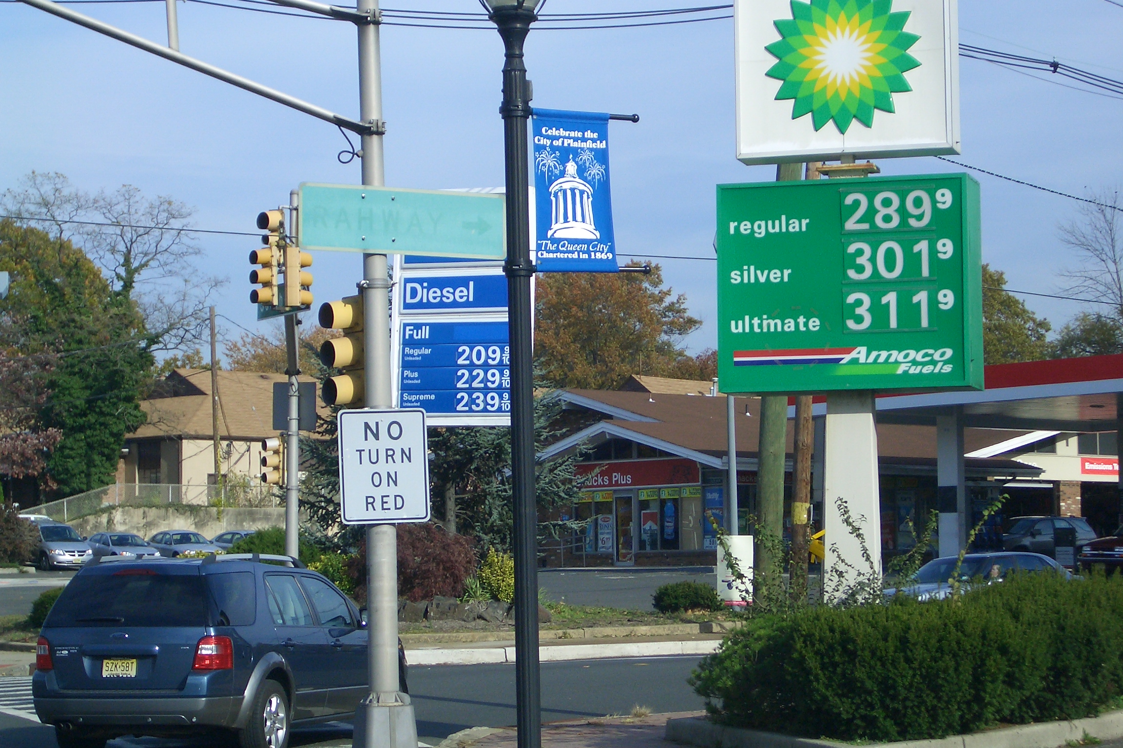
(click on the image for a larger view)
The station on the right closed down during the summer, but they never took the sign down. The station on the left is still open. And so I have a constant reminder about the “Fall fall” of 2006 for gas prices.
80 cents and counting for a gallon of regular gas…
Categories: Money Talk | Comments Off on Local Economic Indicators